STEPHANIE BLOSSOM
Stephanie Blossom creates decorative candles and favors intended for thoughtful gifting.
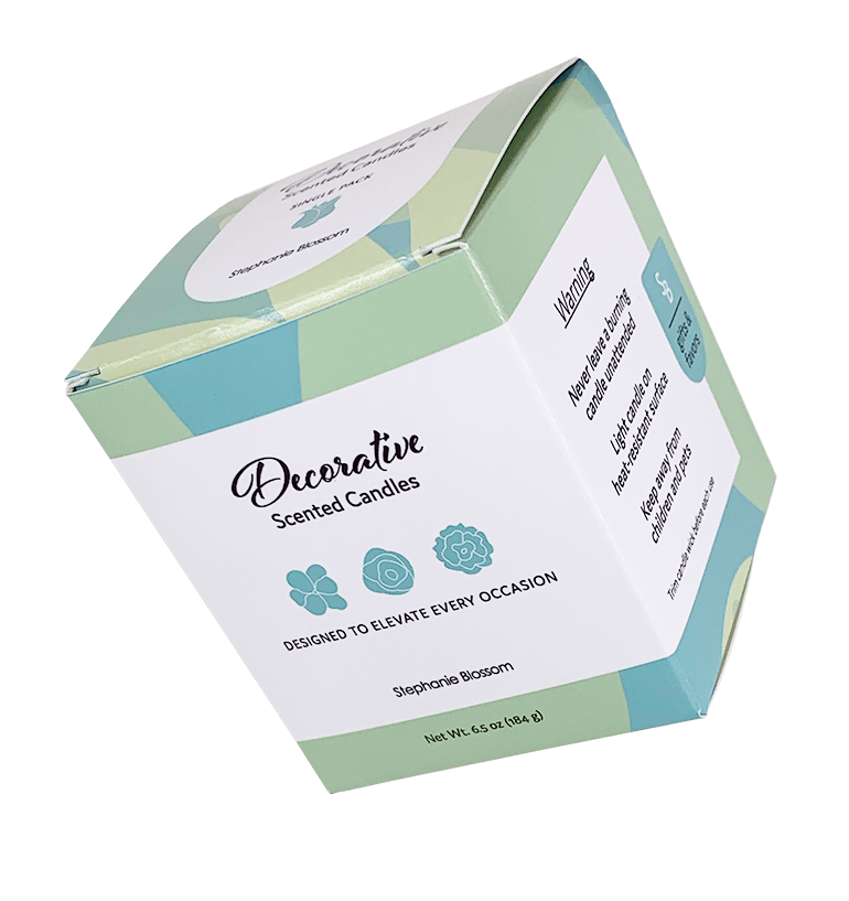
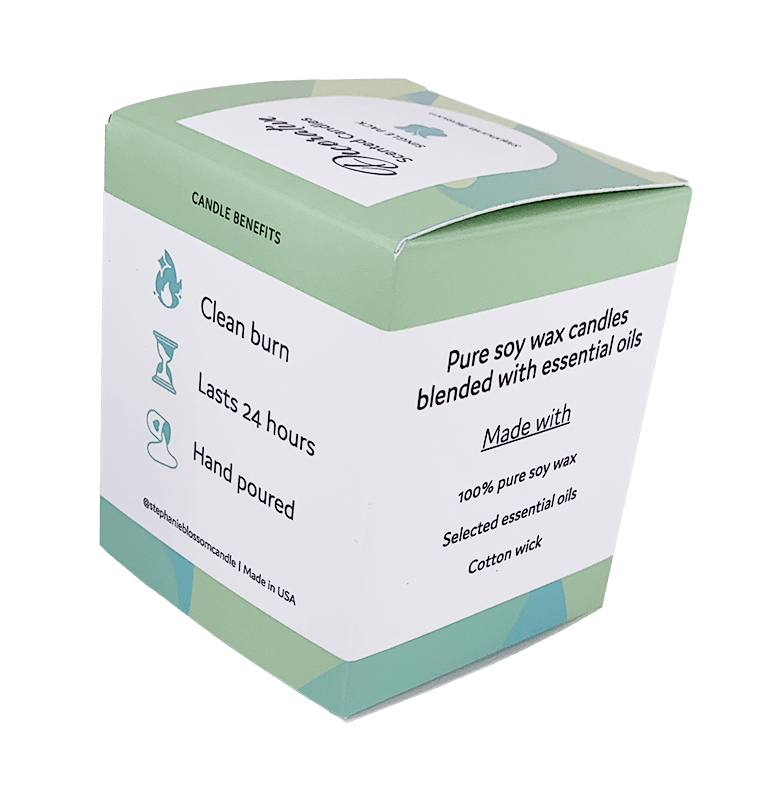
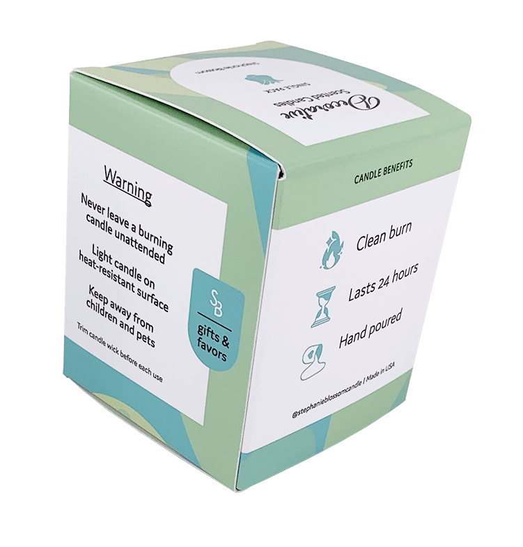
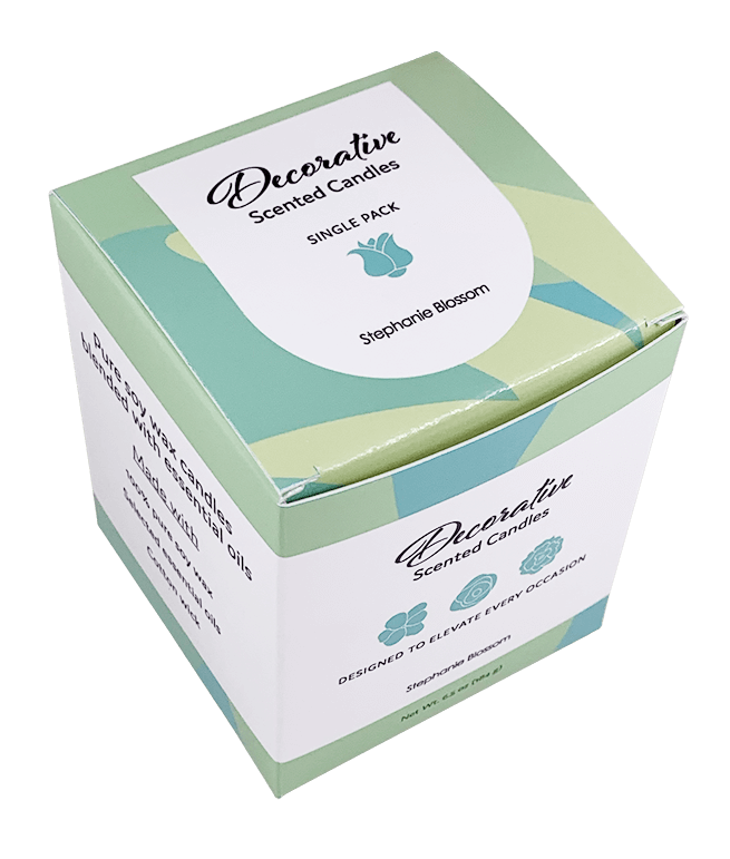
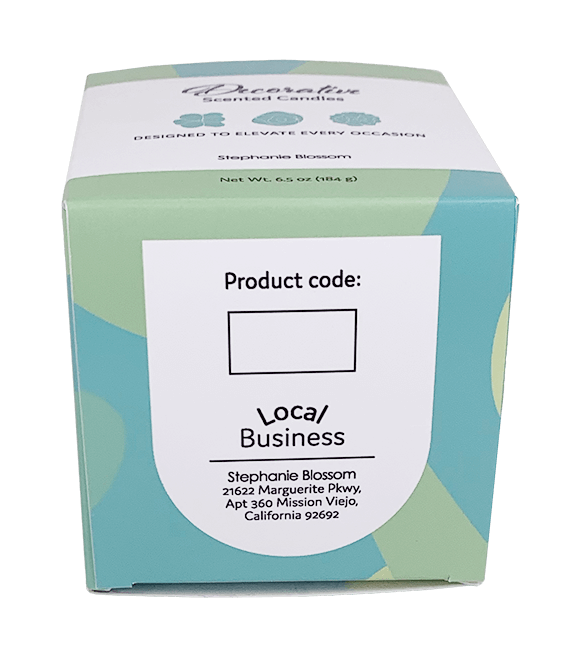
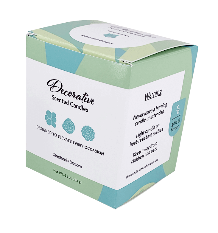
Packaged in a reusable reverse tuck-end box, each candle combines floral and geometric elements to give a soft, sculptural look that feels both natural and special.
The design leans into its role as a favor or gift, offering a thoughtful presentation that feels ready to share.
Packaged in a reusable reverse tuck-end box, each candle combines floral and geometric elements to give a soft, sculptural look that feels both natural and special.
The design leans into its role as a favor or gift, offering a thoughtful presentation that feels ready to share.
Packaging
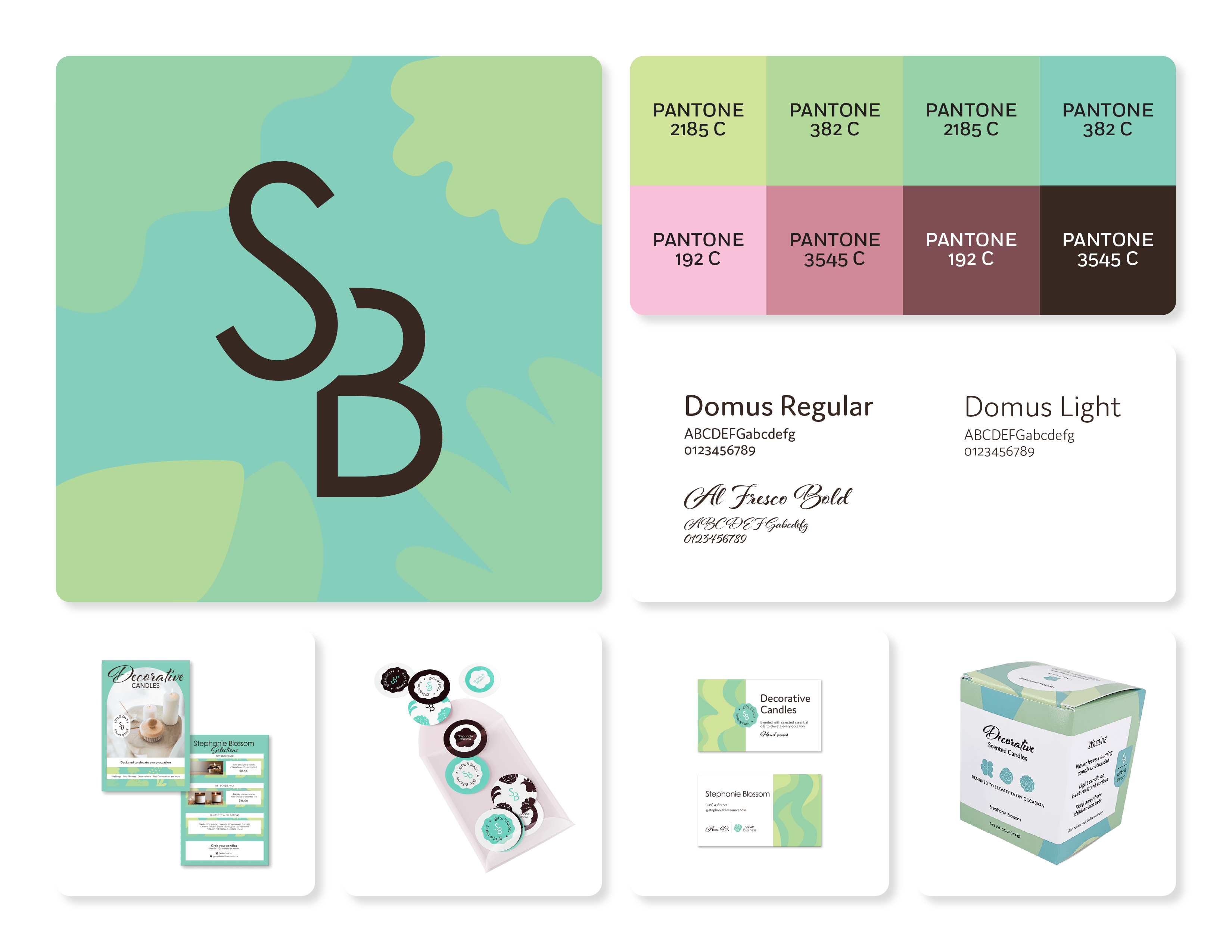
Visual Identity