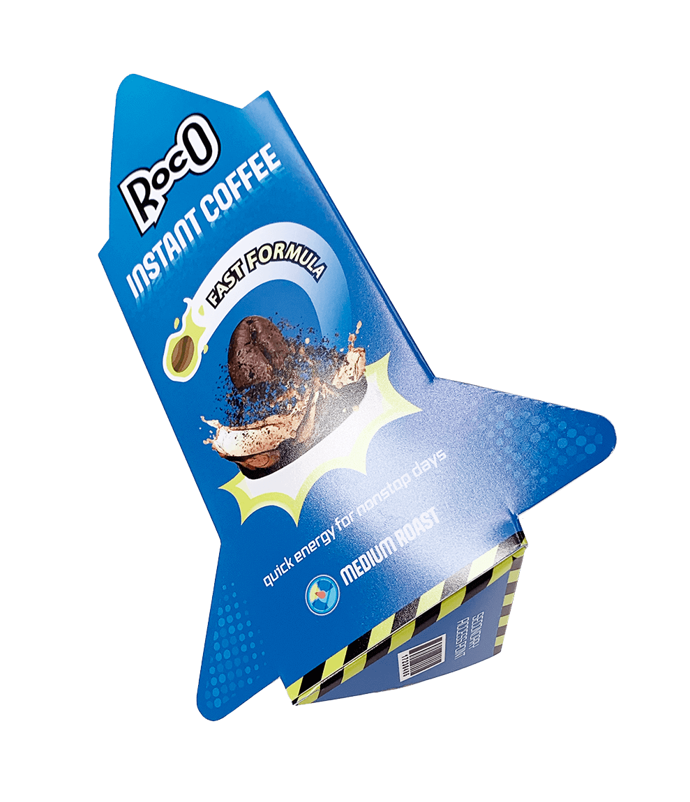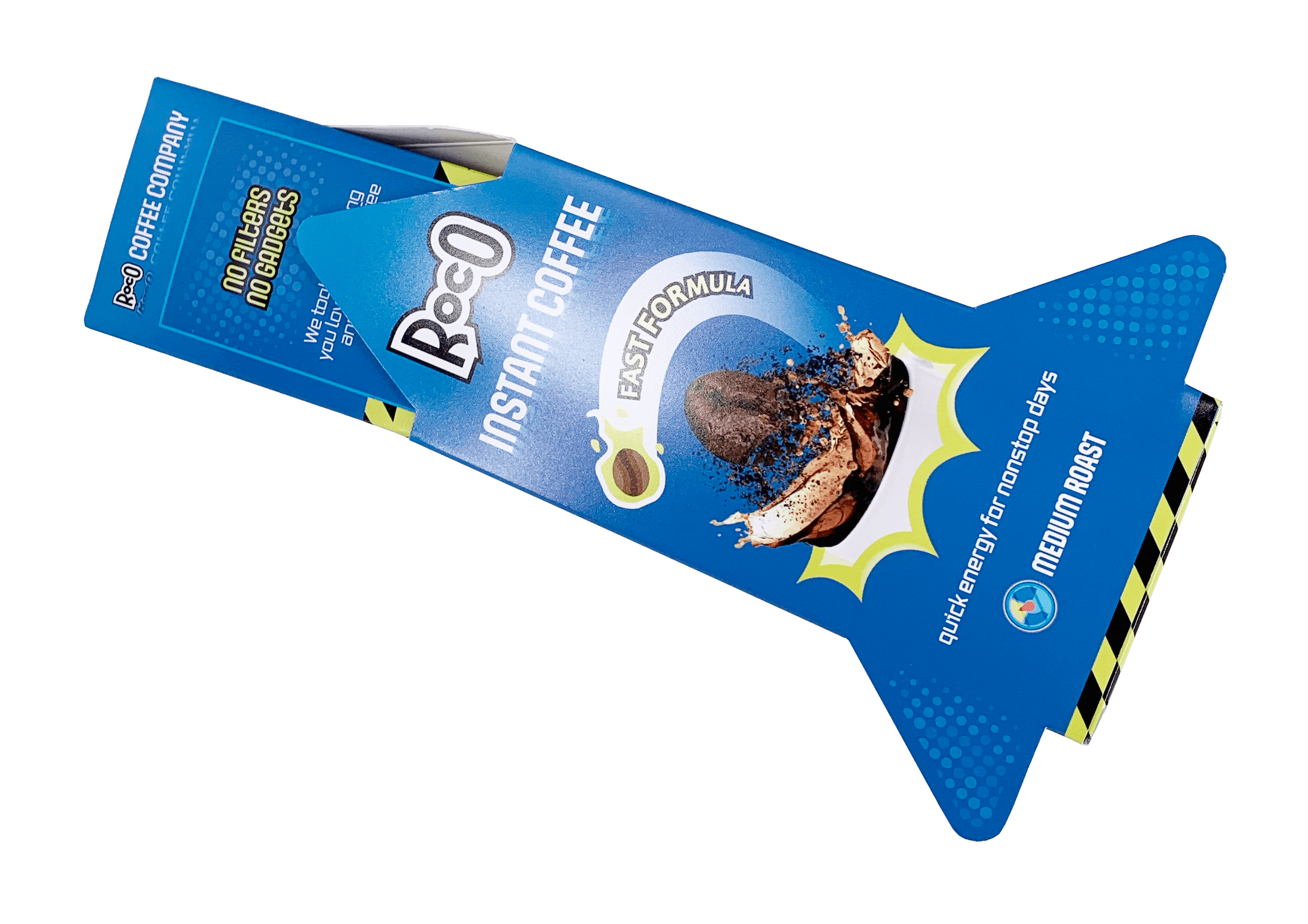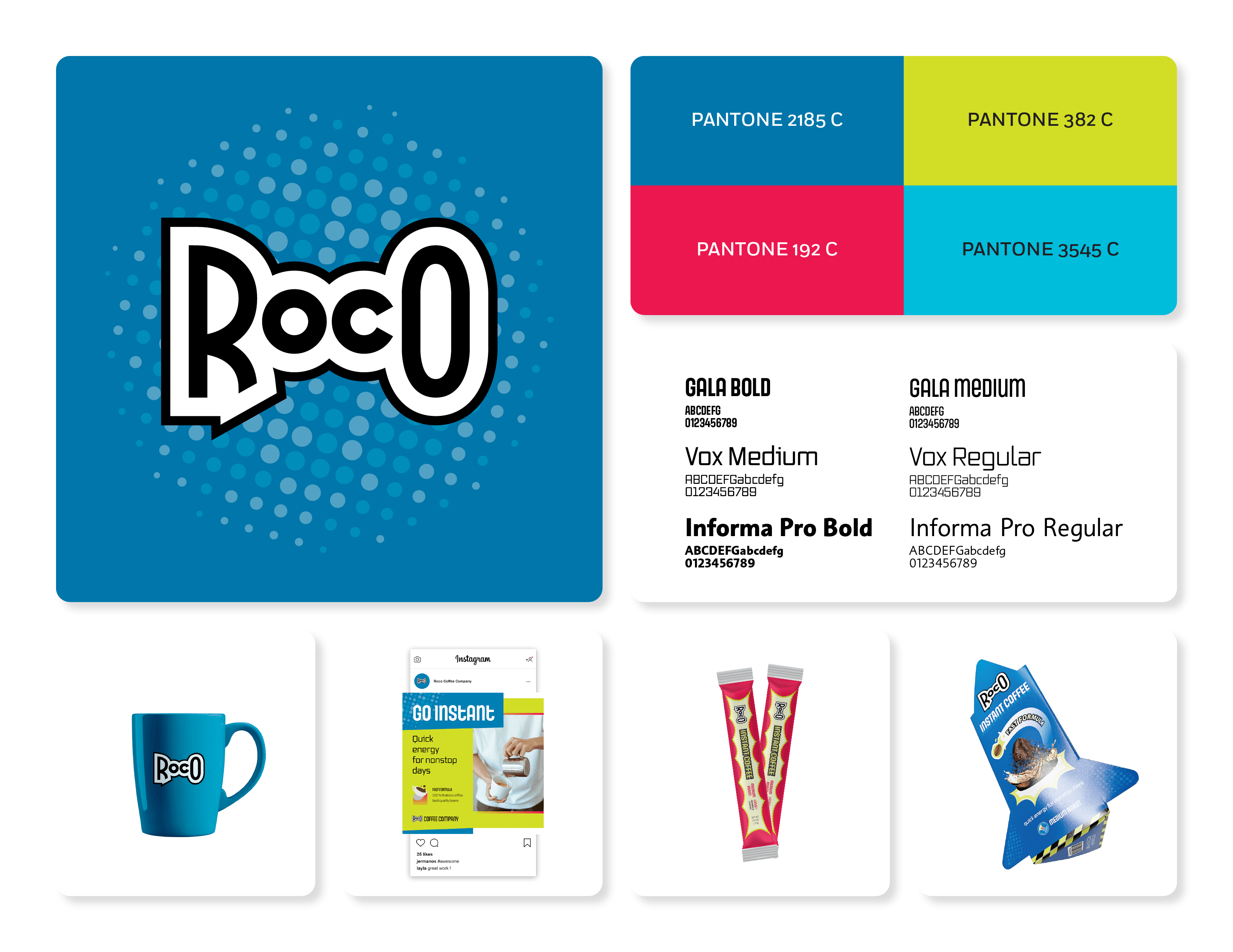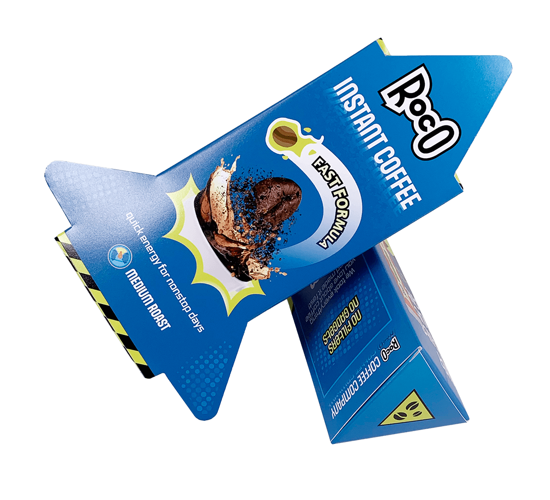
ROCO INSTANT COFFEE
Roco is an instant coffee brand that turns a simple daily habit into a full-on launch sequence.
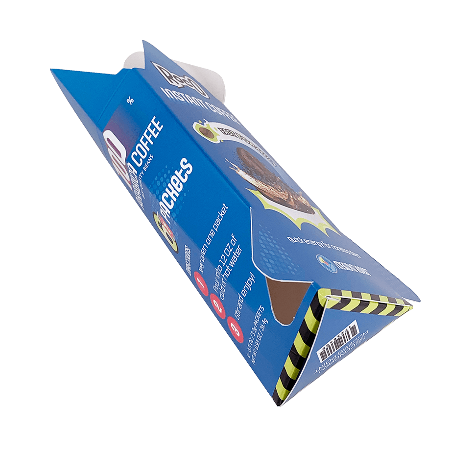
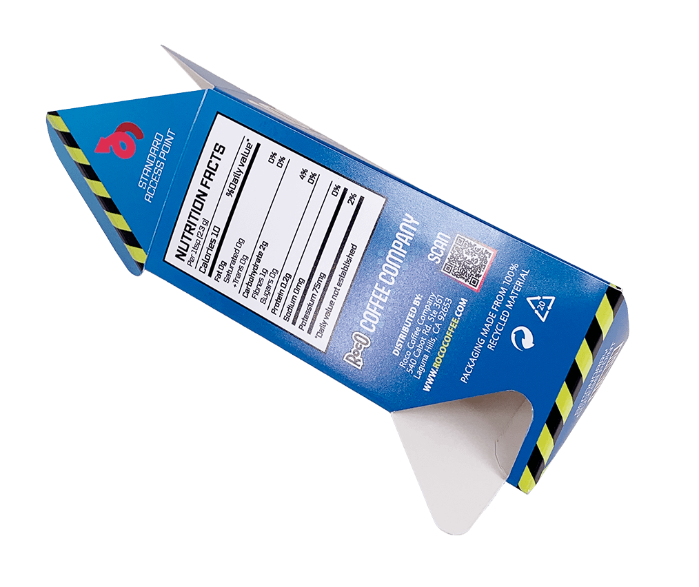
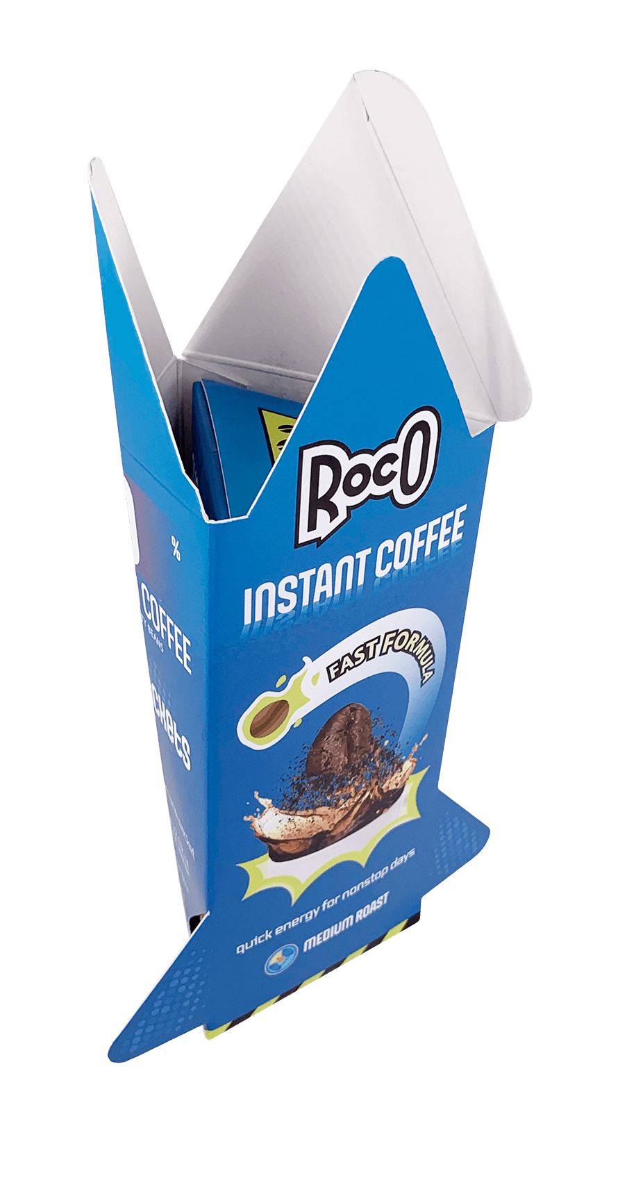
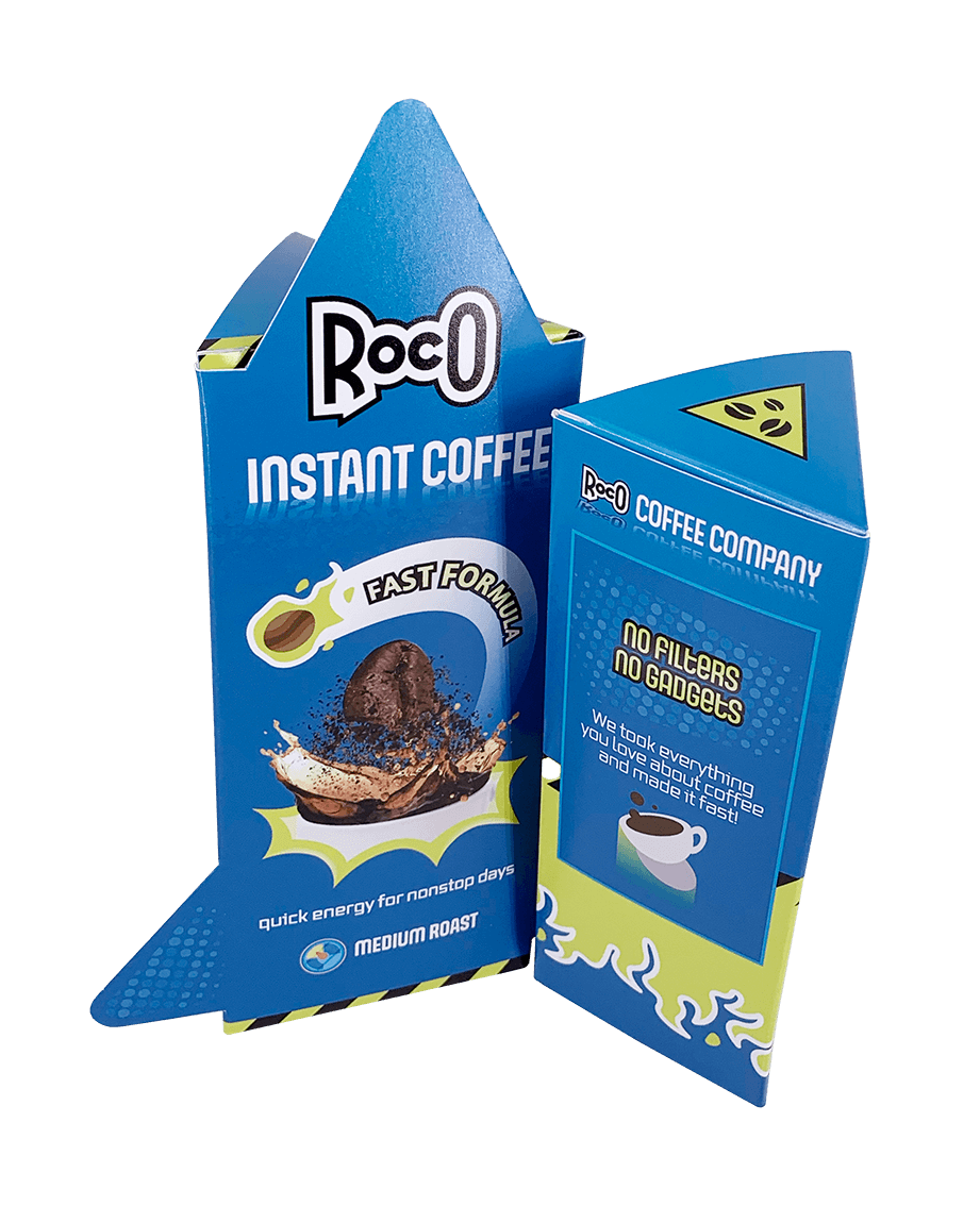
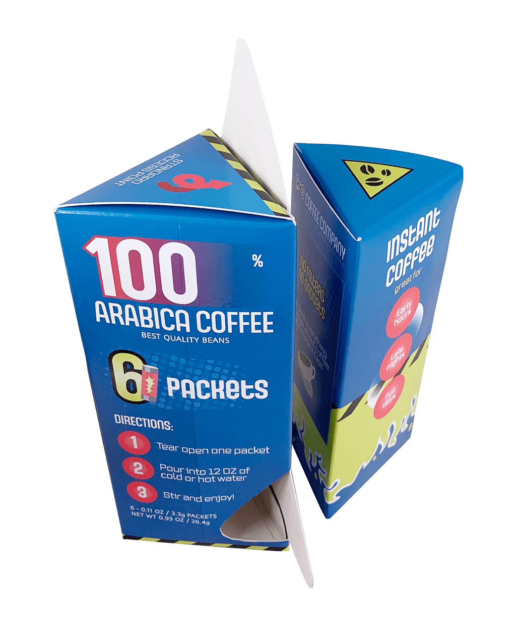
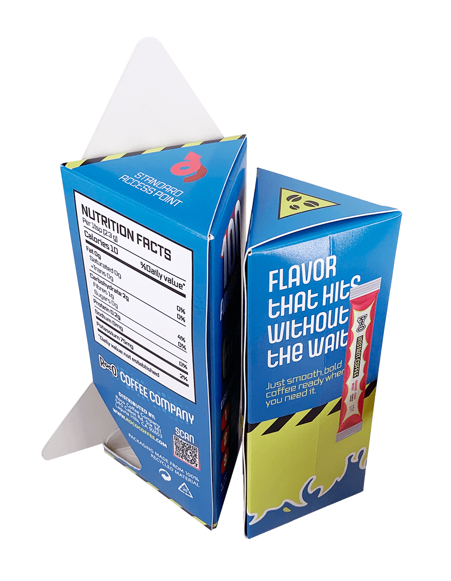
Packaged in a triangular prism structure inspired by rockets, the box reveals itself in layers, from sculptural cutouts to a second interior box that holds the coffee packets.
With bold sci-fi visuals and an energetic vibe, Roco is meant to make early mornings and long nights feel a little more fun.
Packaging
Visual Identity